

"To App or not to App", seems to be the question.
We receive a lot of RFP documents that list mandatory requirements such as "Do you have a Mobile App? Yes or No". Rarely is there an explanation of the use case or context provided for this requirement. In many cases, I'm not sure that the creators of these documents really know that they may be asking the wrong question entirely. It should be "please describe how do you provide mobile access for learners and admins" as the responses will be more nuanced and can prove to be a big differentiator between vendors.
I can't help but think that somewhere along the way, people are being convinced that native Apps are the only way to provide learners with mobile access to their LMS. The problem is, this is simply not true - unless you have a very specific use case in mind.
The reality is that if you need to ensure that the broadest possible base of learners can access your LMS on their phone or tablet (and desktops), then responsive design is the way to go!
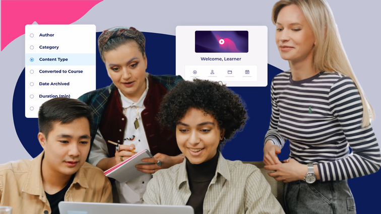
What is a responsive interface? A responsive interface/website/application will automatically adjust its layout depending on the size and orientation of the user's screen. In the case of Absorb LMS, our learner dashboard will move our standard tiles from the usual 3 column-wide layout to one or two columns wide. Our Billboard area will load up a small or medium image, and our survey and assessment tool will wrap text to ensure that learners can still participate on their mobile device. This is all presented in HTML5, ensuring that Apple users, Windows Users and Android Users alike can navigate the LMS learner interface (otherwise you'd need a uniquely coded app for every platform). Users can navigate the Catalog and enroll (and even purchase) courses, view their transcript, view their Instructor Led schedule and anything that they can do in the learner interface on a desktop computer (Windows or Mac).
When we brand our dashboard for clients as part of our standard implementation services, we make sure that each page of the learner interface works and looks great on mobile devices. The real benefits here are worth stating:
- you deploy one system with one URL to all learners
- learners will experience a single interface design across all devices
- you only have one system to support (and we do the updates for you)
- you don't "shut out" a subset of mobile learners (many companies don't offer Windows Apps anyway)
- you don't have to update Apps across multiple platforms when operating systems change.
A responsive interface greatly simplifies your deployment and support of the LMS while ensuring a consistent user experience on all platforms. It's up to you, of course, to ensure that your online courses are mobile-friendly (if you want them to be). The good news is that most authoring tools, such as Storyline by Articulate, offer a "write once, publish to many device" workflow. And native MP4 videos work great for mobile as they automatically scale for different screen sizes. Create your assessments using the Absorb built-in assessment tool and you are mobile-ready!
To learn more about the benefits of our multi-award-winning and mobile-friendly Absorb LMS, give our demo a try from any device.
