"Dear Doctor, I'm concerned about Stanley. He has developed an unusual growth between his left thumb and index finger. The growth is the size of an average hardcover book, yet thinner. One side is silver and emblazoned with the image of an apple. The other glows with an iridescent light. Stanley does not appear to be in any pain. Nevertheless, I know he's concerned since he stares and taps at the growth constantly. Sincerely, —Concerned"
"Dear Concerned, Please rest assured that we in the medical community are keeping close watch of this condition, which is reaching global epidemic proportions. So far, it appears to be benign and may in fact result in heightened curiosity, increased knowledge, and new skills. —Your caring doctor"
Computer tablet sales are in 2013 predicted to outpace sales of traditional computers. There are currently almost as many mobile phones on the planet as there are people. These devices are becoming extensions of ourselves, rarely leaving our hands. Futurists say we're on the cusp of becoming cyborgs. We laugh and think this is crazy… until we misplace our mobile device and have to deal with the resulting separation anxiety. The fact that people increasingly use mobile devices to communicate, collaborate, and access Web content is having a huge impact on the design of user interfaces for enterprise software applications. Here are some examples.
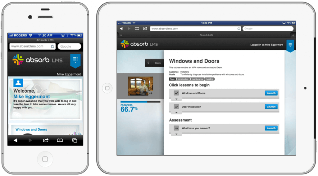
- Rather than shrinking down a traditional computer user interface to fit the smaller screens of mobile devices, smart designers create interfaces that adapt or `respond' to different screen sizes as well as vertical and horizontal orientations. In the example below, interface elements are resized and rearranged to best display on an Apple iPhone and iPad.

- Prior to the mobile revolution, many web sites were designed with a navigation menu that runs along the top of the screen. That works fine using conventional computers but is a poor choice for devices such as tablets which you typically cradle in both hands. Having a thumb touch the top middle of the screen is awkward on larger touch screens. Smart mobile interface design places navigation elements within comfortable range of human thumbs.

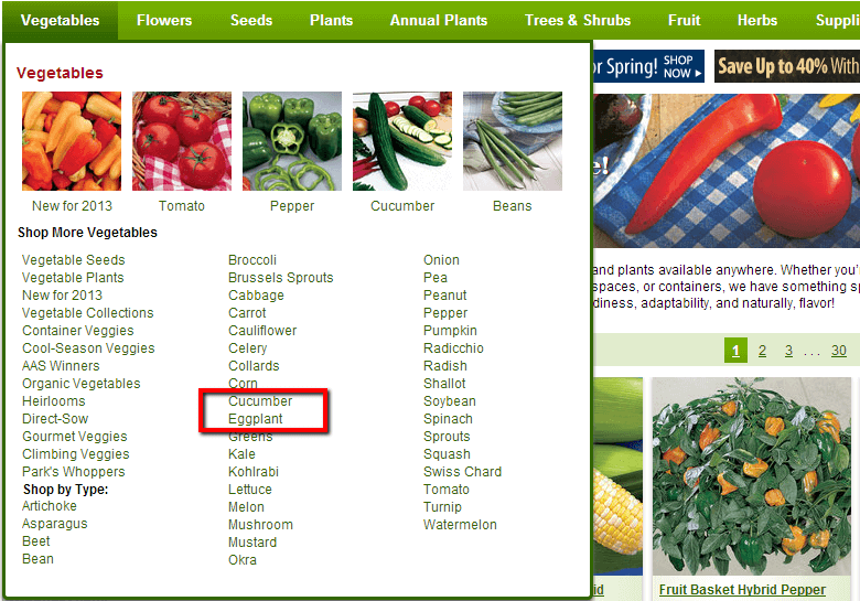
- Attempting to click tiny hyperlinks on small touch screens using human fingers is frustrating. Below is a screen capture from a popular garden supply company. This site looks really nice on my iPad. Unfortunately, whenever I attempt to add eggplant to my shopping cart, I get cucumber. The links are simply too close together for my fingers to select what I need without zooming in. (I wonder if my family would notice if I substituted cucumber for eggplant in my famous eggplant parmigiana recipe?)

Smart designers create user interfaces where all clickable elements such as hyperlinks and buttons are large enough to be selected with fingertips.

Tablets and phones are now ubiquitous so software designers and content providers need to assume that people will be accessing their content on a mobile device. What might look great on a traditional computer monitor may be completely unusable on a phone or tablet.


